ANNOUNCEMENT: I will be going on maternity leave at the end of June 2025, with the intention of returning to work later on this year.
When it comes to setting the tone for your big day, your wedding stationery is one of the very first glimpses your guests will get of what’s to come. It’s more than just paper, it’s a mood, a feeling, and an introduction to the celebration ahead. And one of the most powerful ways to express that? Colour.
Choosing a colour palette for your wedding stationery can feel overwhelming at first, especially with so many beautiful shades and combinations out there, but don’t worry, I’ve got you. In this post, I’ll walk you through some simple ways to select colours that reflect your style, tell your story, and bring everything together beautifully.
Think about how you want your wedding day to feel. Is it romantic and soft, modern and bold, rustic and relaxed? The mood you’re aiming for will naturally lend itself to certain colour palettes. For example, soft blush and sage green work beautifully for a timeless garden wedding, while deep navy and gold might suit an elegant evening celebration.
Your venue and season can also offer clues – a winter wedding in a historic manor house might call for rich, moody hues, while a summer barn wedding could lean towards earthy neutrals and pops of colour from nature.

Your stationery should feel like you. Are you drawn to classic and understated looks, or do you love a bit of drama and flair? If you’re not sure where to start, look at your wardrobe, home décor, or Pinterest boards, you’ll often find a pattern in the colours you gravitate towards.
And remember: your wedding stationery doesn’t have to match your wedding colours exactly. It can complement them, introduce a variation, or even highlight one tone as the star. The key is that it all feels cohesive, not cookie-cutter.
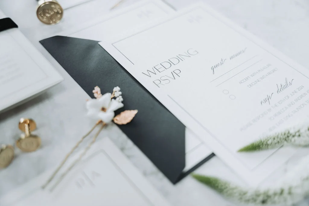
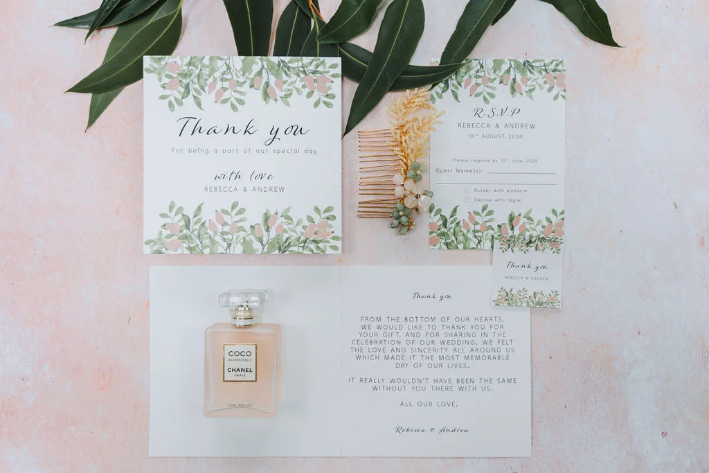
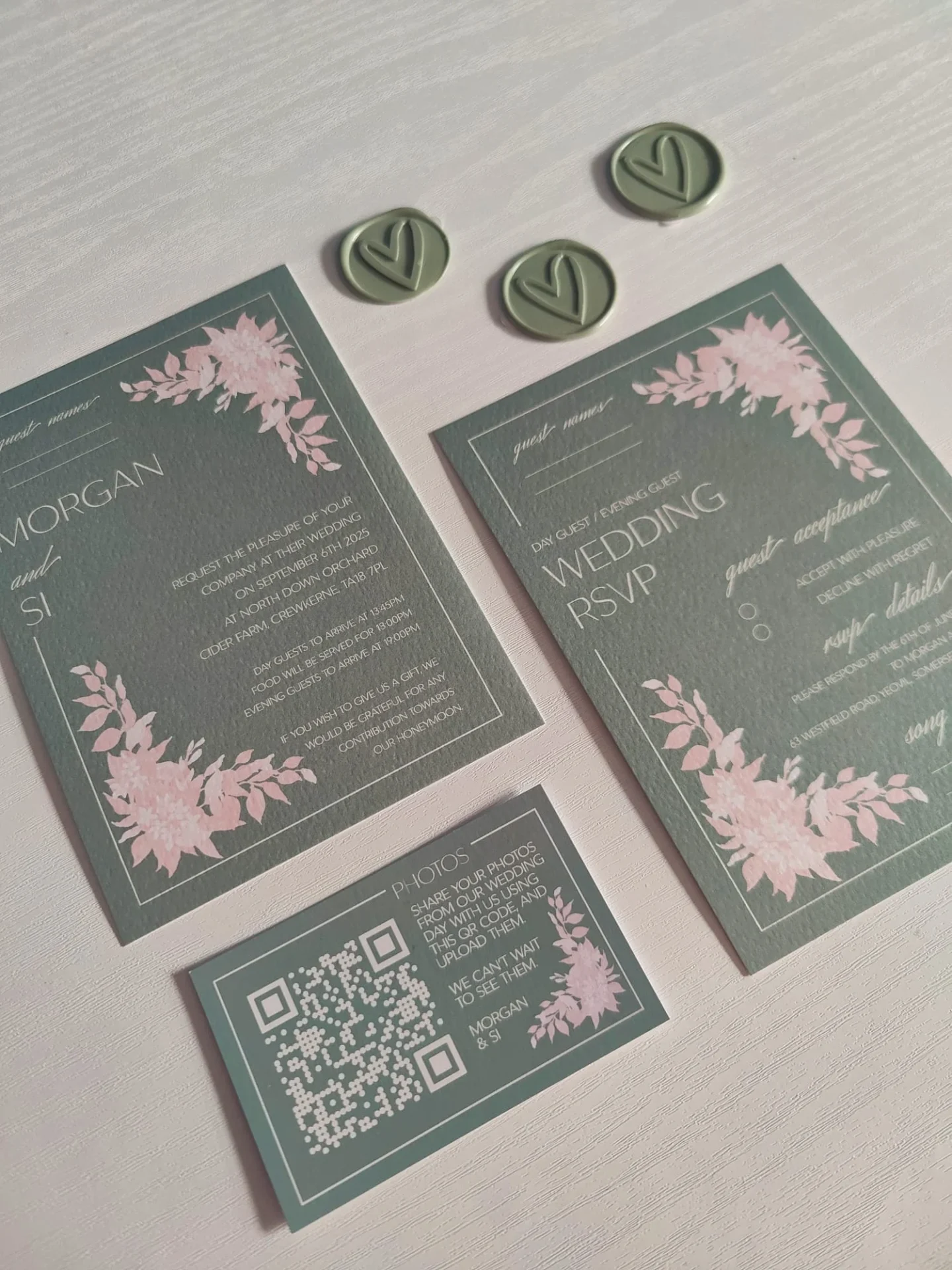
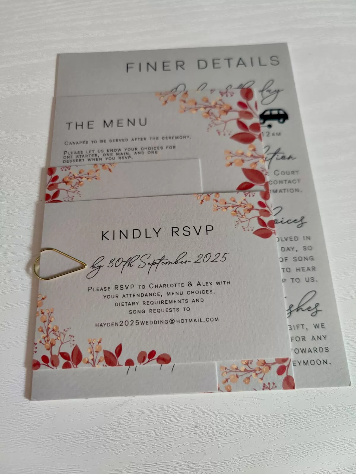
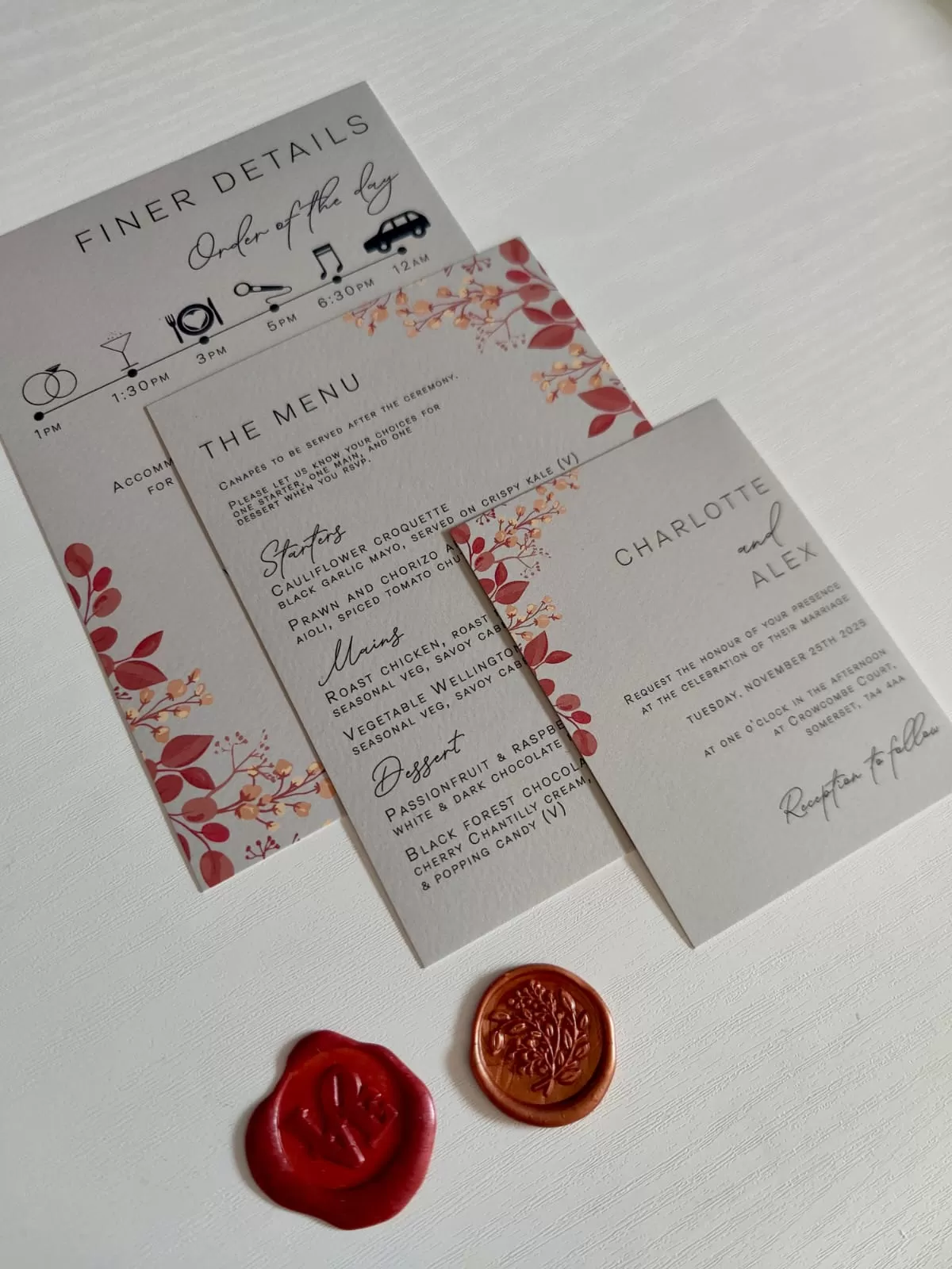
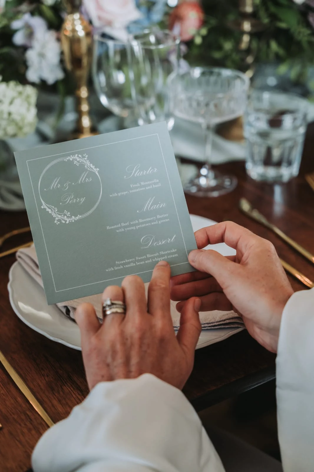
While we all love a statement colour, neutrals can be incredibly effective in stationery design. Soft whites, warm ivories, greys, and muted tones can act as a base that allows your accent colours to shine. They also bring a sense of calm and balance to your designs, and pair beautifully with metallic foiling or textured paper for added interest.
If you’re not sure about going bold, a neutral palette with thoughtful details can be just as striking.
Some colours look different when printed, especially across different textures and finishes. For instance, pale pastels can sometimes appear too faint on matte cardstock, while rich jewel tones might pop more with a glossy or vellum overlay.
If you’re working with a wedding stationery designer (hi, that’s me!), they’ll guide you through these decisions, so you can see how everything comes together before sending to print.
If you’re stuck, step outside. Nature offers the most stunning colour palettes, from soft lavender fields to the changing tones of autumn leaves. You could also turn to your favourite artwork, architecture, or even fashion for unexpected and personal combinations.
Sometimes, the best colour choices aren’t the trendiest, they are the ones that remind you of something special.
One of the most special ways to choose your wedding stationery colours is to start with something meaningful to you as a couple. Maybe it’s the deep green of the forest where you got engaged, the sunset orange from your favourite holiday, or the lilac of the flowers you always buy each other “just because.”
Your colour palette can be a quiet nod to your shared memories, heritage, or the little details that make your relationship unique. Even if no one else knows the story behind your choices, you will, and that makes every piece of stationery feel even more personal.
When your wedding colours come from the heart, they won’t just look beautiful… they’ll mean something, too.
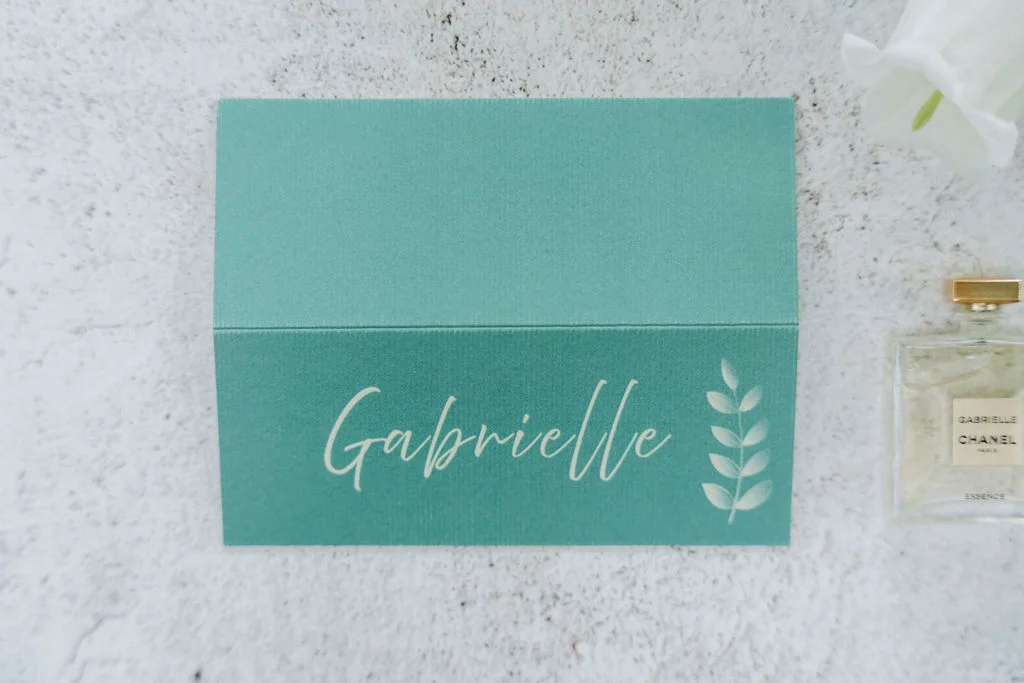
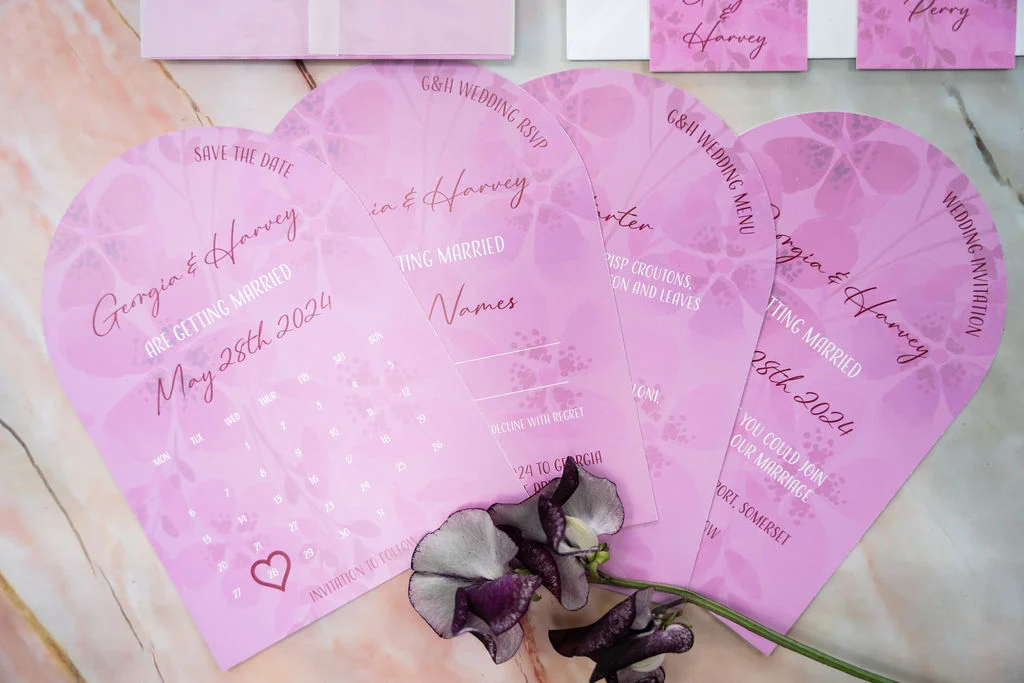
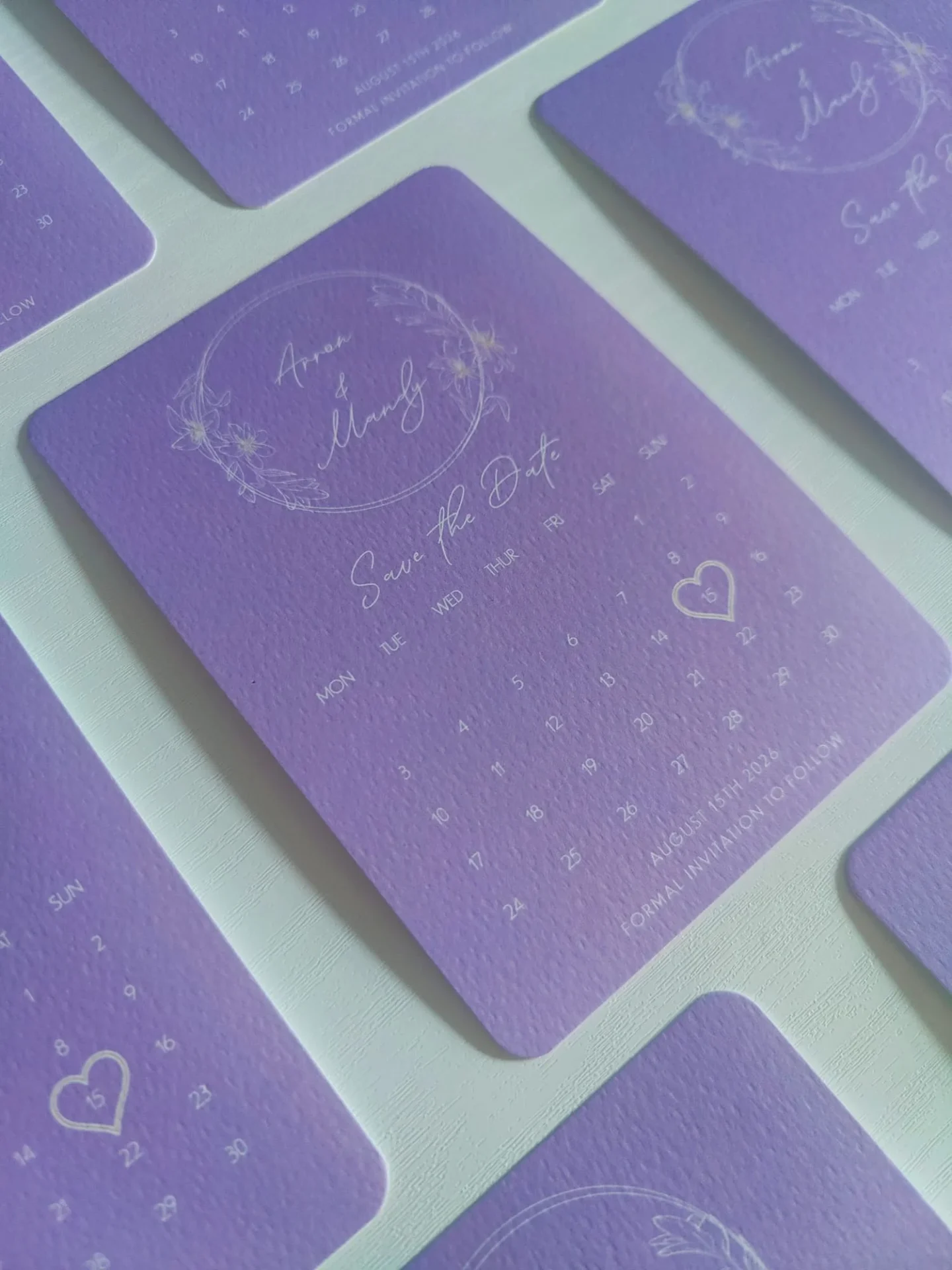
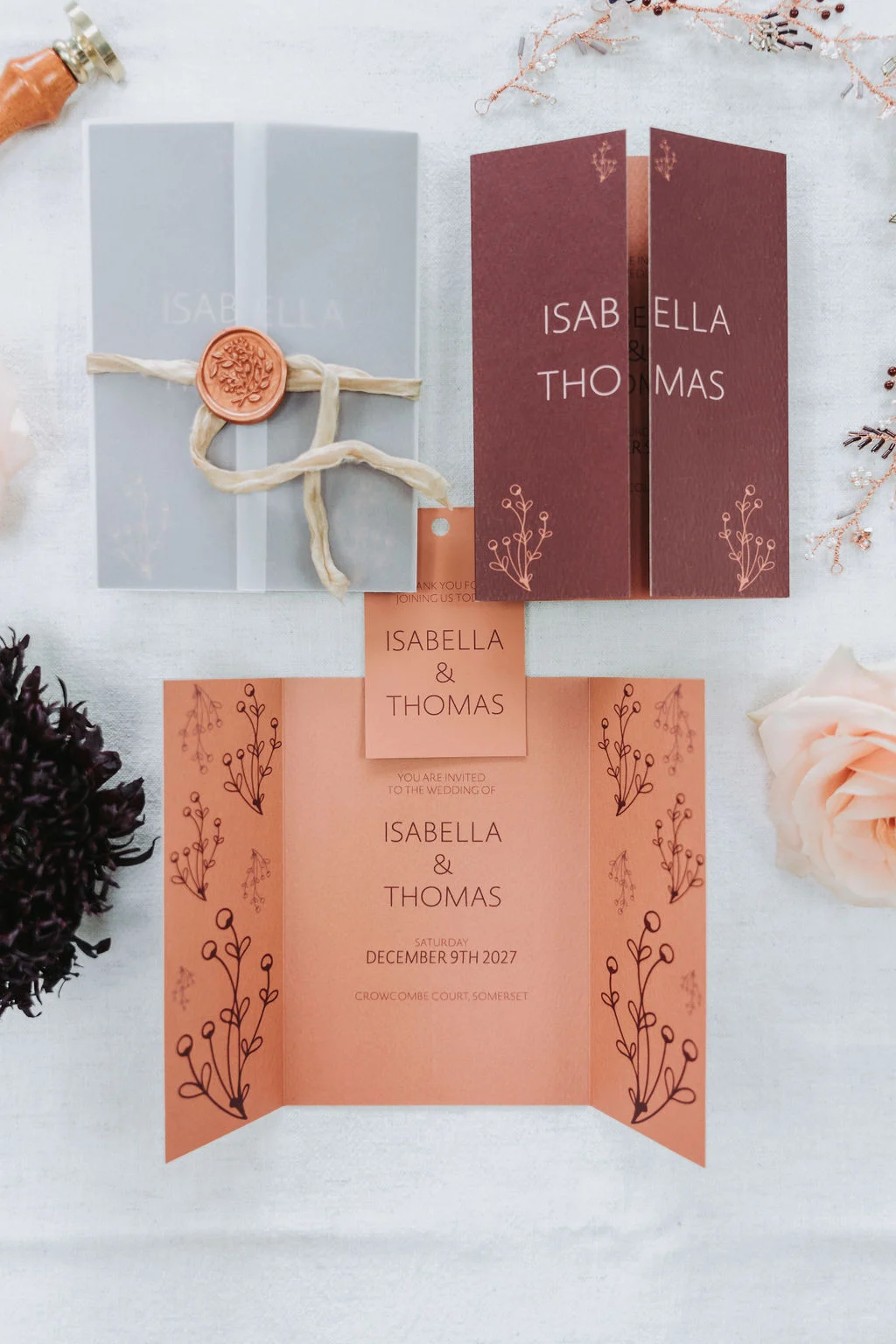
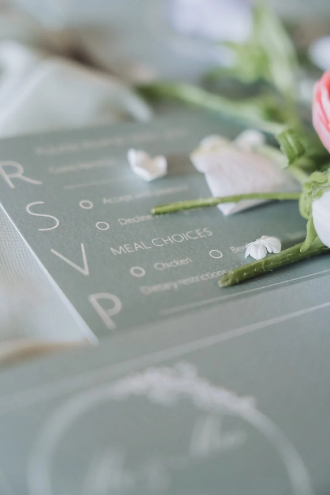
Once you’ve chosen your colours, think about how they’ll flow across your full wedding stationery suite, from save the dates to on-the-day pieces and thank you cards. Your palette doesn’t have to be used in the exact same way each time, but a sense of continuity helps everything feel beautifully considered.
For example, you might feature your main colour more prominently on your invitations, then bring in accent tones through envelope liners, wax seals, or your table plan. Or, you could reverse the palette for your menus and place cards to keep things fresh but cohesive.
A layered, thoughtful approach not only elevates your design, it tells a visual story that ties every detail together.
Choosing your wedding stationery colours should feel exciting, not stressful. Whether you go for timeless tones or something totally unexpected, the best palette is one that feels like you. If you’re still feeling unsure, I’m here to help you bring it all together and create something that feels beautifully cohesive from save the dates to thank you cards.
After all, your wedding stationery isn’t just about the day, it’s a keepsake of this incredibly special chapter. Let’s make it one to remember.
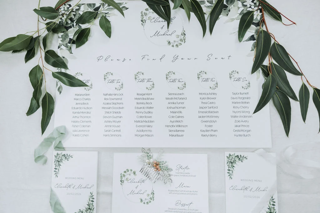
To view more of my wedding stationery designs, including invitations, RSVPs, save the dates, seating plans, welcome signs and so much more, please take a look at my website links below, Instagram or Facebook pages, or my Pinterest page:
If you’re interested in having wedding stationery designed for your special day, whether this be an invitation, a save the date, a details card, a timeline sign, an RSVP, or whatever you may need for your special day, please get in touch with me today.