ANNOUNCEMENT: I will be going on maternity leave at the end of June 2025, with the intention of returning to work later on this year.
Your logo is important, it’s the visual shorthand for your brand. But a truly successful brand is more than just a pretty picture. It’s a holistic experience that resonates with customers at every interaction.
Let’s explore how to build a consistent brand experience across all touchpoints, from your website to your customer service interactions.
I will show you some examples of real life businesses that I have been involved in.
Consistency builds trust. When your brand feels the same wherever you find it, customers know what to expect. This makes them feel comfortable, boosts brand recognition, and keeps them coming back for more.
On the flip side, if you’re inconsistent, it can confuse people, weaken your message, and even damage your reputation. Plus, consistent branding seriously boosts your brand equity. When customers have good, consistent experiences, they think your brand is worth more. This can mean happier customers, the ability to charge a bit more, and being better equipped to handle competition.
A consistent brand is also easier to spot in a busy market, helping you stand out and making your marketing way more effective.
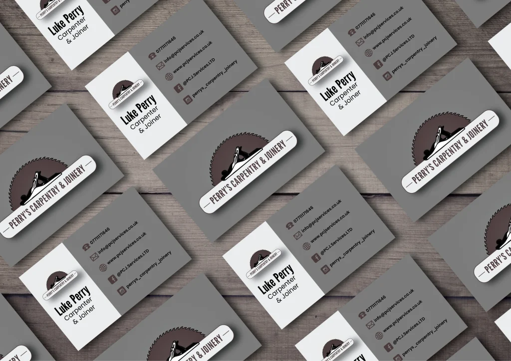
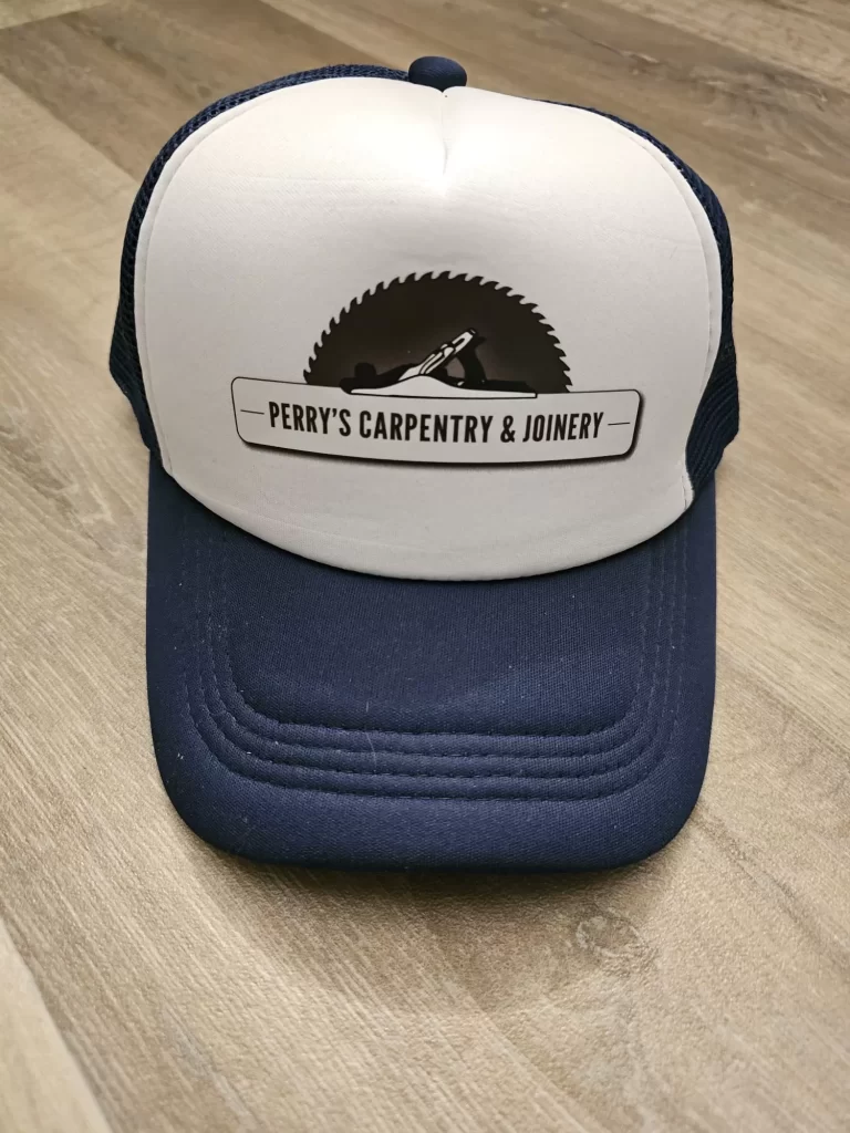
Perry’s Carpentry & Joinery (PCJ Services) offers a wide range of carpentry and joinery services, including building cabinets, designing and installing doors, and focuses on creating bespoke creations tailored to client specifications, aiming to exceed expectations. PCJ emphasises a friendly, reliable approach and promise quality, care, and a professional outlook in every project. PCJ’s commitment to client satisfaction and high-quality woodworking is evident in their services and testimonials.
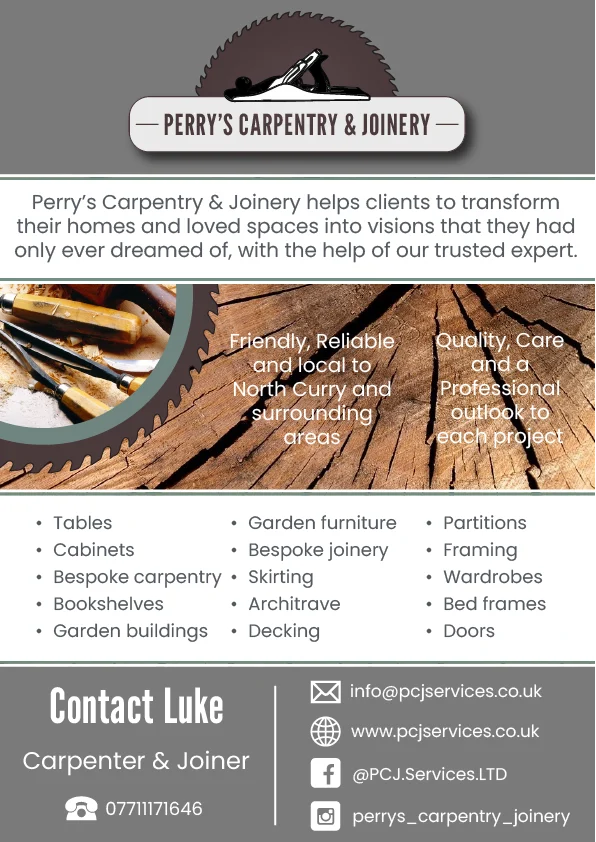
PCJ presents a brand image of professionalism, expertise, and trustworthiness through the website. The clean and functional design, coupled with high-quality images of the bespoke carpentry and joinery projects, showcases the craftsmanship and attention to detail. Testimonials further reinforce their reliability and customer-centric approach, emphasising their commitment to exceeding expectations. The brand clearly values delivering quality services tailored to individual needs, transforming spaces with skill and care.
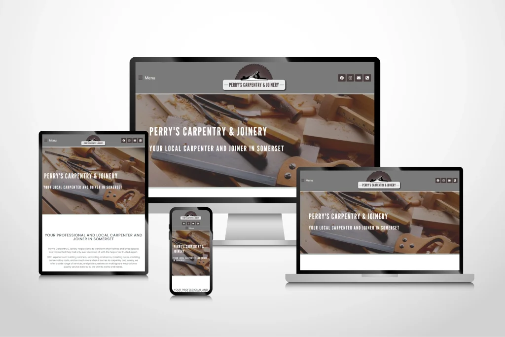
The website maintains a consistent visual identity through a primary colour palette of browns, whites, and greys, and this is also present within the marketing materials for PCJ. Brown conveys trust and stability, while white offers a clean and modern backdrop, and the grey adds sophistication and reliability. These colours, combined with consistent typography and imagery focused on showcasing the work, create a cohesive and professional presence.
The subtle inclusion of wood tones in project images subtly reinforces their core business. Overall, the brand projects an image of competence and dedication to high-quality woodworking, which is conveyed through the marketing materials and customer service.
Here’s a breakdown of key touchpoints and practical tips for ensuring brand consistency, and I will use my own brand identity as the example throughout these points.
Your website is often the first impression a potential customer has of your brand. It’s crucial to get it right.
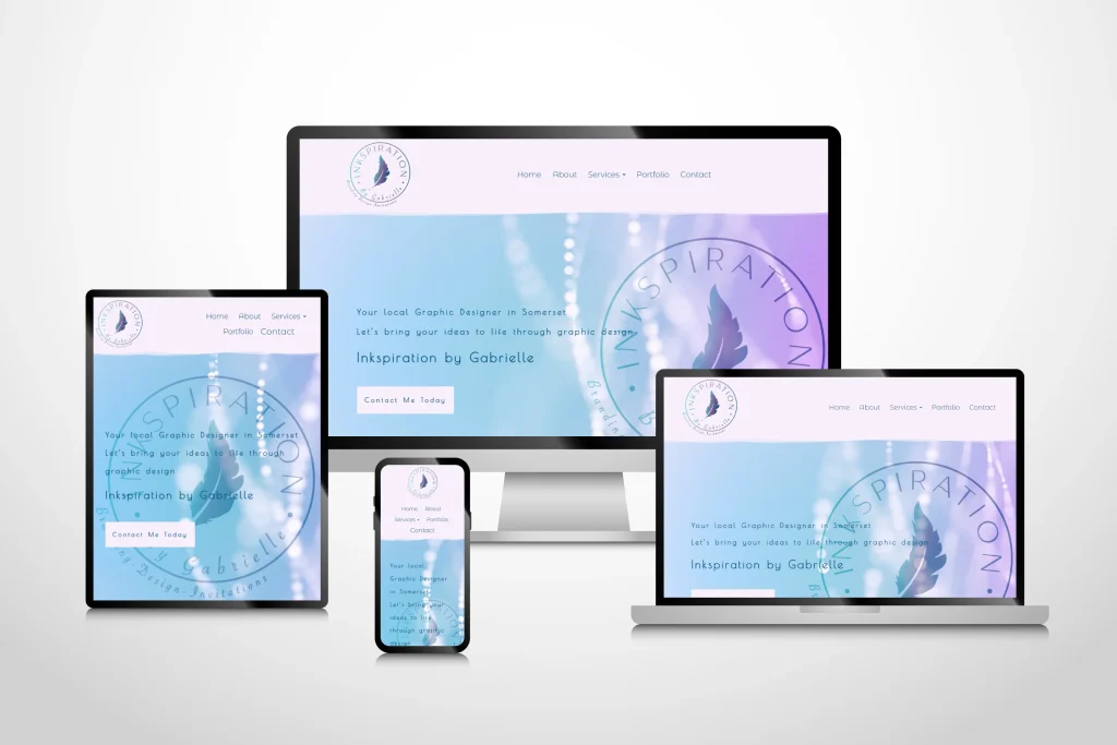
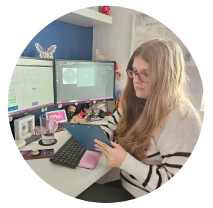
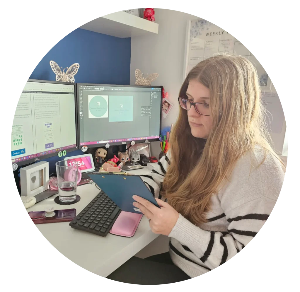
I love my website. I feel that it capture the essence of me and my brand identity perfectly, with the use of colours and curves, with a professional and clean feel, it says “I design, I am colourful, I am a professional”.
Social media offers a direct line of communication with your audience. Consistency is key to building a strong online presence.

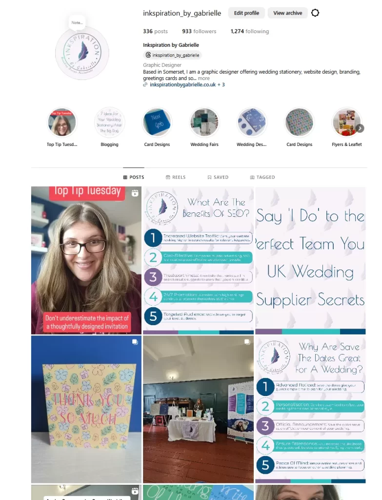
When it comes to my socials, I ensure that my content is consistent, and i post certain content on certain days of the week, and any graphics are full of my brand identity and logo. I feel it’s also important to let your clients see the face behind the business, and I try to do this as often as time allows.
If you sell physical products, your packaging is a crucial touchpoint. It’s the tangible representation of your brand.
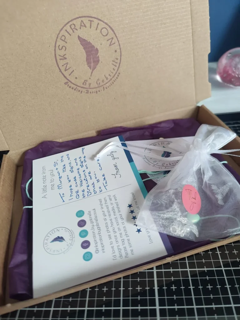
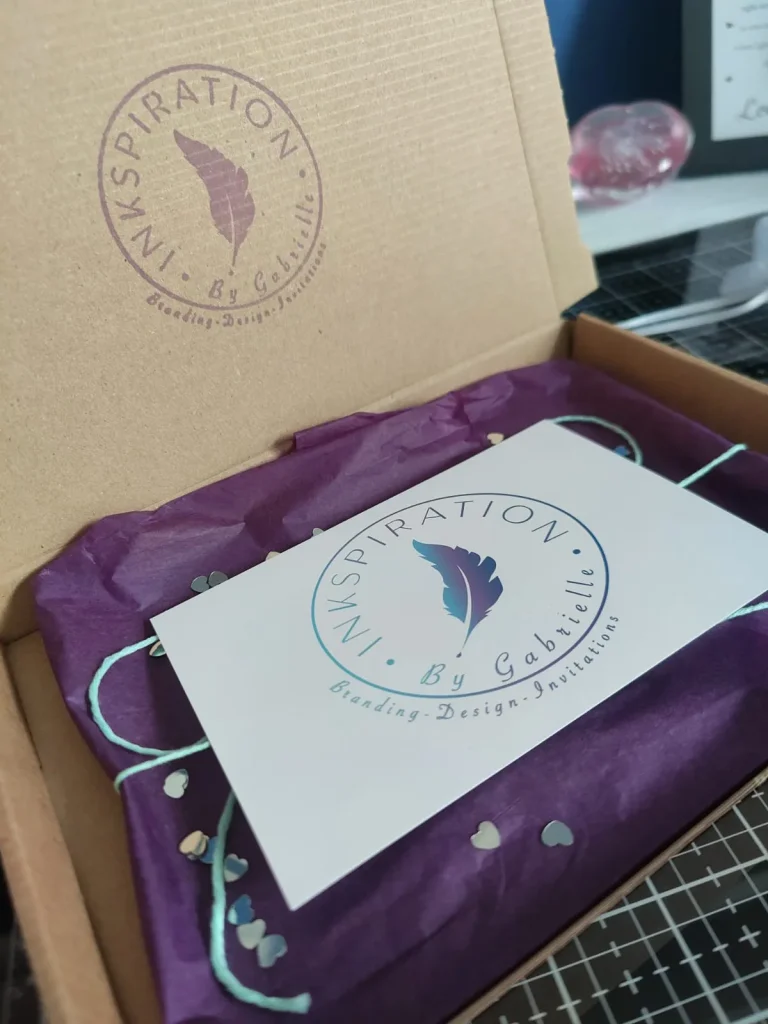
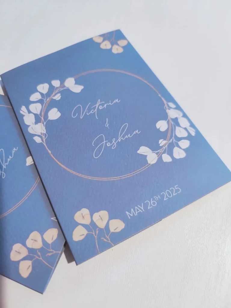
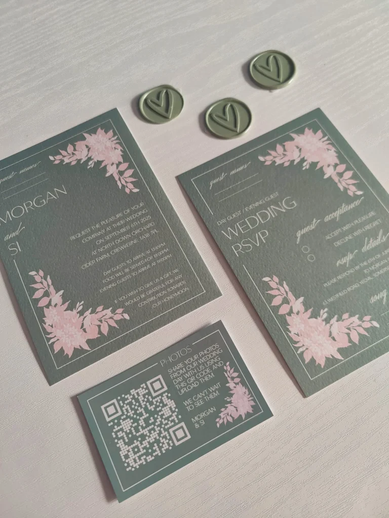
As you can see from the images above, this is just 1 example of some wedding stationery that I sent out to a client. When I package up designs, I will use a box where I stamp my logo onto it, using a blue or purple ink to be in keeping with my brand colours.
I will also use either a purple or blue tissue paper to wrap up the items, and I seal the tissue paper with a sticker with my logo on. I then tie a coloured bow, matching the colours from the items colour pallet, and I include a postcard with my logo on it which I am then able to write on to send a personal message to the client, along with my business card, and a free little gift.
Every interaction with you or your customer service team is an opportunity to reinforce your brand.
I pride myself on bringing ideas to life, through my skills and eye for design, along with the communication that needs to take place with my customers to ensure that I am delivering their wants and needs. I keep my customers involved and updated of each step of the process, and continue to give and gain feedback to ensure all is correct. The bonus of the work I do is I have met some lovely people, and gained some friend’s along the way.
This is part of my brand, being organised, keeping people involved in the projects, being friendly and bringing peoples visions to life. I am just me, and I feel my brand reflects this. Below are some testimonials and feedback that I have gained through my time of running my business.
“Such a lovely Women, so helpful. Did everything we wanted and checked in with all the little details, to make sure we were happy! Would definitely recommend Gaby, to take some of the stress out of planning your wedding!”.
– Vicky & Josh, Wedding Stationery
“Me and my partner met this lovely lady at a wedding fair and my oh my am i glad i went, nervous first timer, parents live in another country and Gabrielle helped me no amounts, she delt with my constant messages and we finally came to our perfect invites and RSVPs, Gabrielle captured everything we wanted in out invites and they are more than i can have ever imagined.
– Morgan & Si, Wedding Stationery
Not only did Gabrielle become our go for anything now we also become friends, i cant wait to start on the rest of the wedding stationary.
Thankyou so so so much xx”.
“Gaby has been an absolute pleasure to work with and has exceeded my expectations for designing my website, branding/logo, and business cards. I am extremely happy with everything she has produced for me! She has been so approachable and friendly throughout the whole process, has always kept in touch and ensured I have been happy with everything, and nothing ever seems too much trouble (which is really reassuring as I have been a bit indecisive at times as I am a start-up business myself).
I cannot recommend Gaby enough as she really invests time in you and pulls out all the stops to ensuring a product/service that is reflective of YOU! I am so happy that I chose Gaby to reassure and guide me through this whole process which could have been a lot more stressful than it has been, but she’s made it so easy! Thank you so much Gaby”.
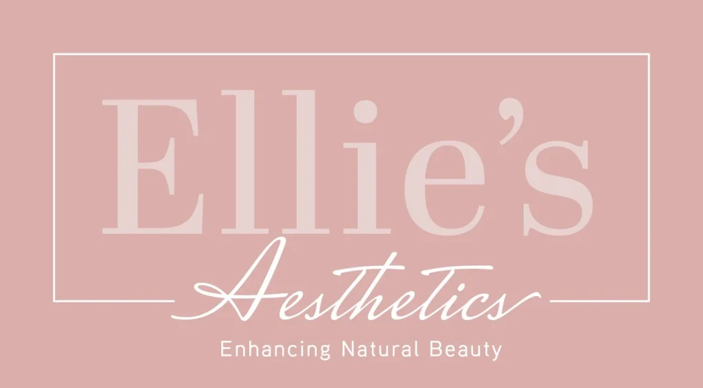
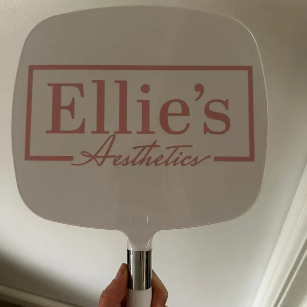
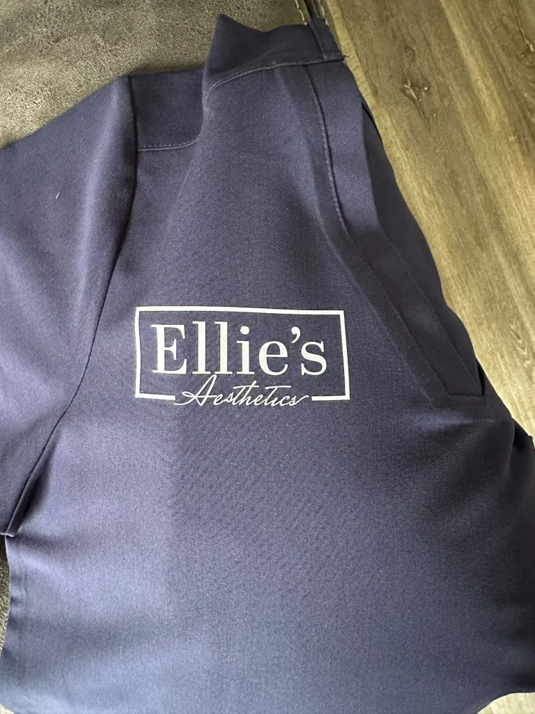
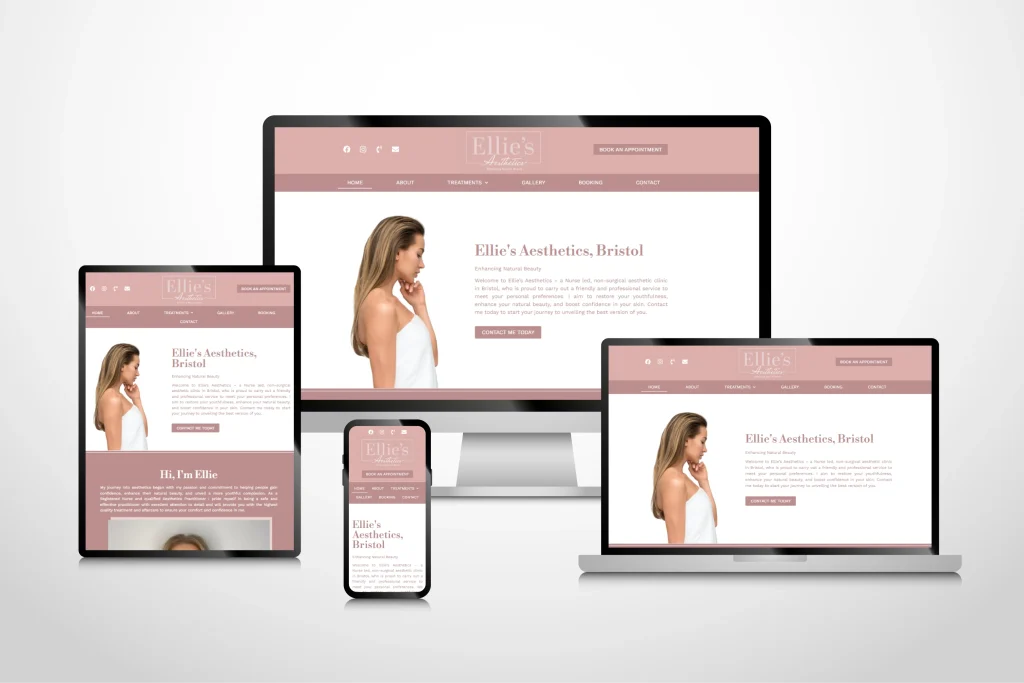
– Ellie Stokes, Ellie’s Aesthetics
Ellie’s Aesthetics presents a brand that is both professional and approachable. They emphasise qualifications and experience, particularly highlighting Ellie’s background within the NHS, which suggests a foundation of medical knowledge and safety. The language used conveys a sense of warmth and reassurance, indicating a focus on client comfort and satisfaction.
The brand’s core offering is centered around enhancing natural beauty and achieving subtle yet noticeable results, a philosophy that prioritises a natural look over dramatic alterations, as highlighted in the testimonials and descriptions of treatments.
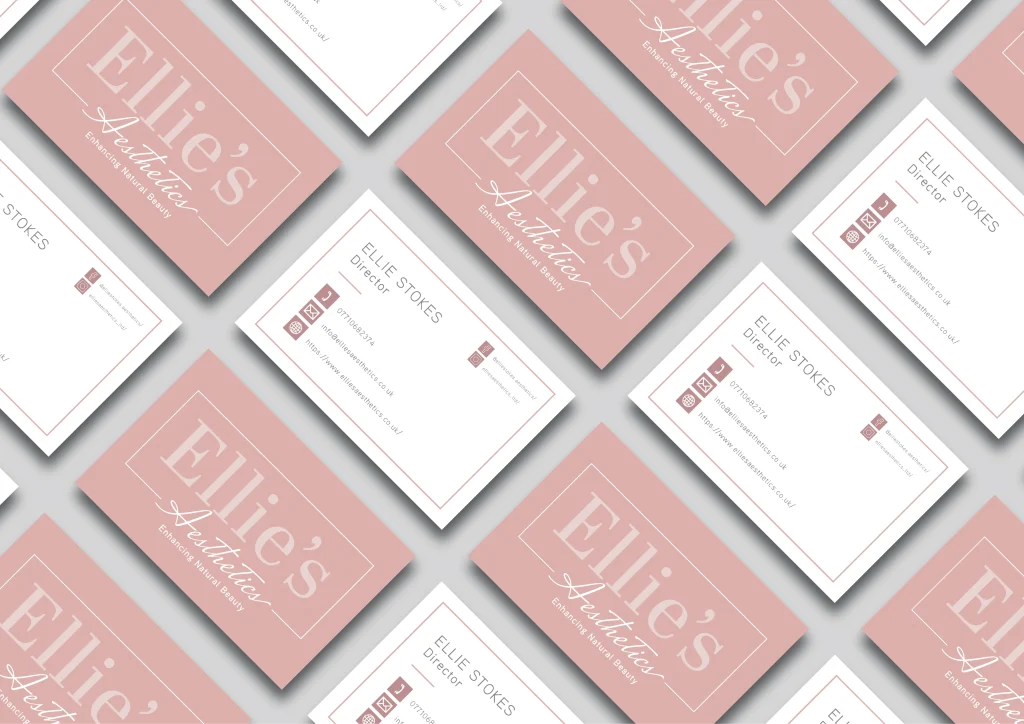
The website design is clean and modern, suggesting a meticulous and trustworthy service. The language used throughout the site is warm and reassuring, emphasising qualifications, experience, and commitment to client comfort and satisfaction. The brand focuses on enhancing natural beauty and achieving subtle yet significant results.
The colour palette of the website is white and pink. The white creates a sense of cleanliness and medical professionalism, while reinforcing the sophisticated and reliable nature of the practice. The pink tones adds a touch of femininity and warmth, softening the clinical feel. This combination of colours contributes to a calming and inviting online presence.
The cornerstone of brand consistency is a comprehensive set of brand guidelines. These guidelines should document:
Regularly check all your touchpoints to make sure they’re following your brand guidelines. This helps you spot any slip-ups and fix them.
Creating a consistent brand experience across all touchpoints takes planning, effort, and keeping an eye on things. By focusing on consistent visuals, messages, and how you interact with customers, you can build a strong, recognisable brand that people love and that helps you succeed.
Remember, it’s not just what you say, but how you say it, and how consistently you get that message across every time someone interacts with you.
To view more of my work, including logo and website design, take a look at my website links below, Instagram or Facebook pages, or my Pinterest page:
If you’re interested in having a logo or website designed for you and your business, contact me today.